Search is great. It gives you the power to find information without having to go through every page of a website. But sometimes, search alone is not enough, and you need filters and sorting options to help you find what you’re looking for. One fantastic way to narrow large sets of content is faceted navigation. In fact, faceted navigation may be the most significant search innovation of the past decades.
Let’s Start With a Definition
A facet is usually designed as a box containing check boxes or links allowing users to narrow search results by several dimensions. Facets are useful for large content sets because they provide multiple filters, one for every specific aspect of the content. Additionally, faceted navigation helps the user get an overview of the content available, making them understand how to search for it1.

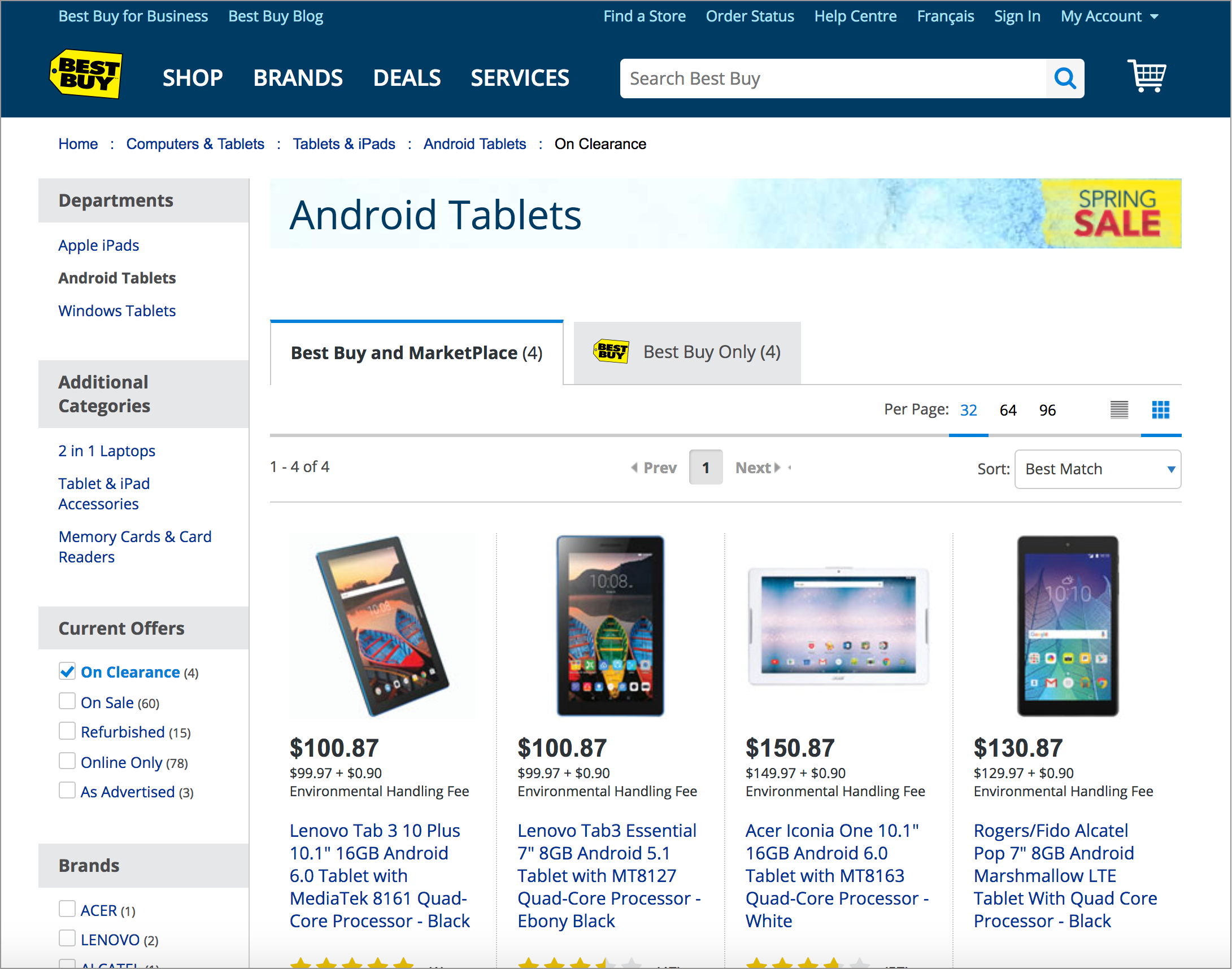
All the filters on the left side of the screen on Bestbuy.ca are facets.
Position of the Facets
We usually see facets on the left side of the search page, and there is a good reason for that: this is what users expect! In most countries, people read from left to right and always start scanning the page from the top-left corner. In fact, eyetracking studies have shown that users spend 80% of their time looking at the left half of the page and 20% at the right half. Positioning facets on the right side therefore results in low adoption and decreases the usability of the search page, since your customers won’t be able to filter results because they won’t find the facets.
Decide on your Filter Value-Selection Paradigm
You’re right: this seem complicated, but I assure you it’s not. When a user filters search results, they either want to go deeper into the content to see what’s there (drill-down paradigm) or they might have specific criteria in mind and want to do a batch filtering (parallel paradigm)2. Someone can of course want to do both in their visit on a website, but rarely need to do both at the same time.
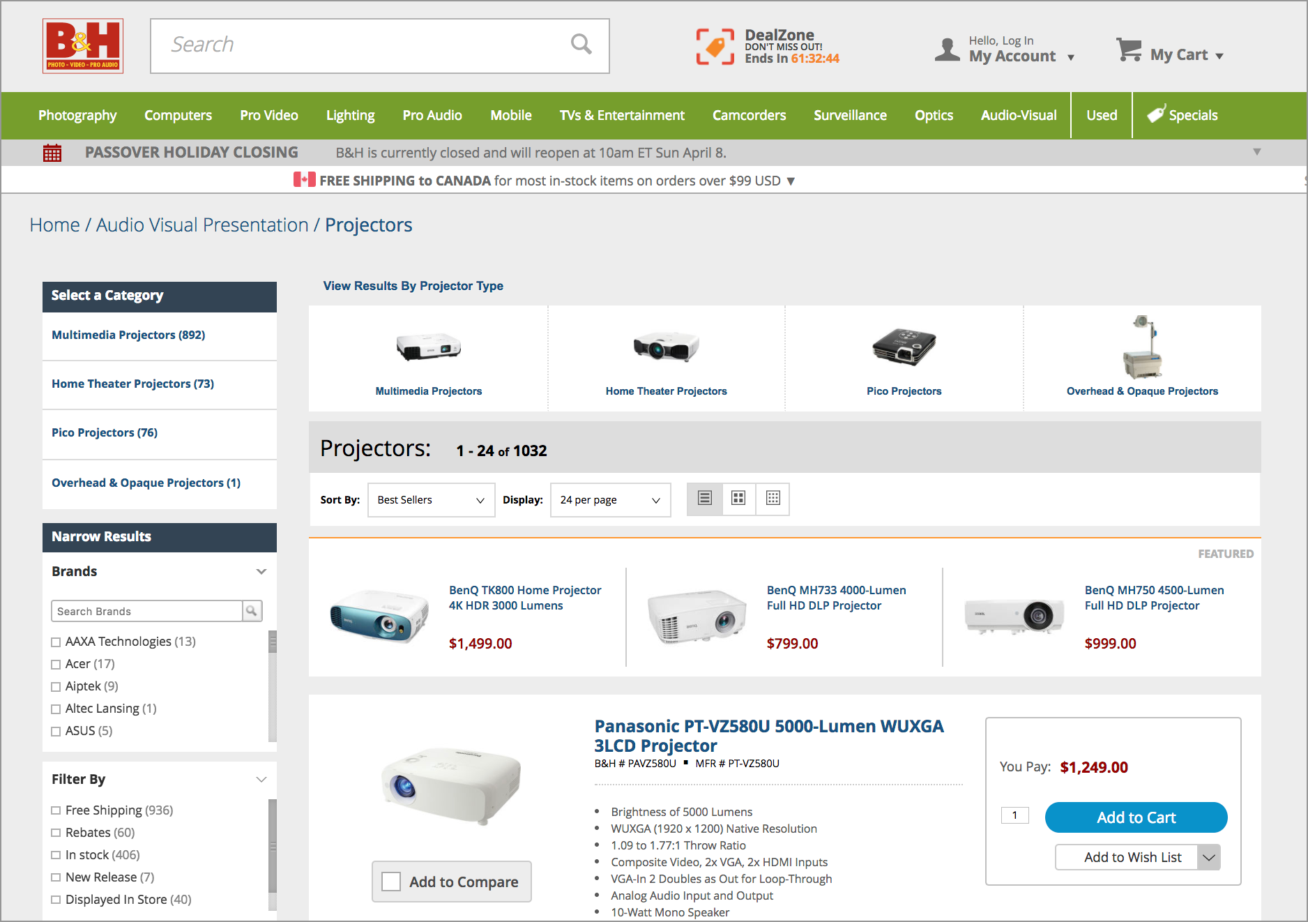
Let me give you an example. If a customer on the B&H website is looking for a projector for their home theater, they might search for “projector” and then go to the Home Theater Projectors category (drill-down paradigm). After that, they might want to refine by price, brand, resolution, or any other criteria that is relevant for a home projector using facets (parallel paradigm).

The user first did a search for “Projector” and then selected the “Home Theater Projectors” category to narrow the results to what they were looking for.
Usually, the component used for a drill-down selection is a link because it usually indicates a straightforward equals condition, for example “I want to narrow my search results to Department equals Home projectors”. Sometimes, this type of filter can be designed as horizontal tabs if you don’t need to display multiple levels in a hierarchy. However, if you have to display a hierarchy, a facet with multi-level category links is better.

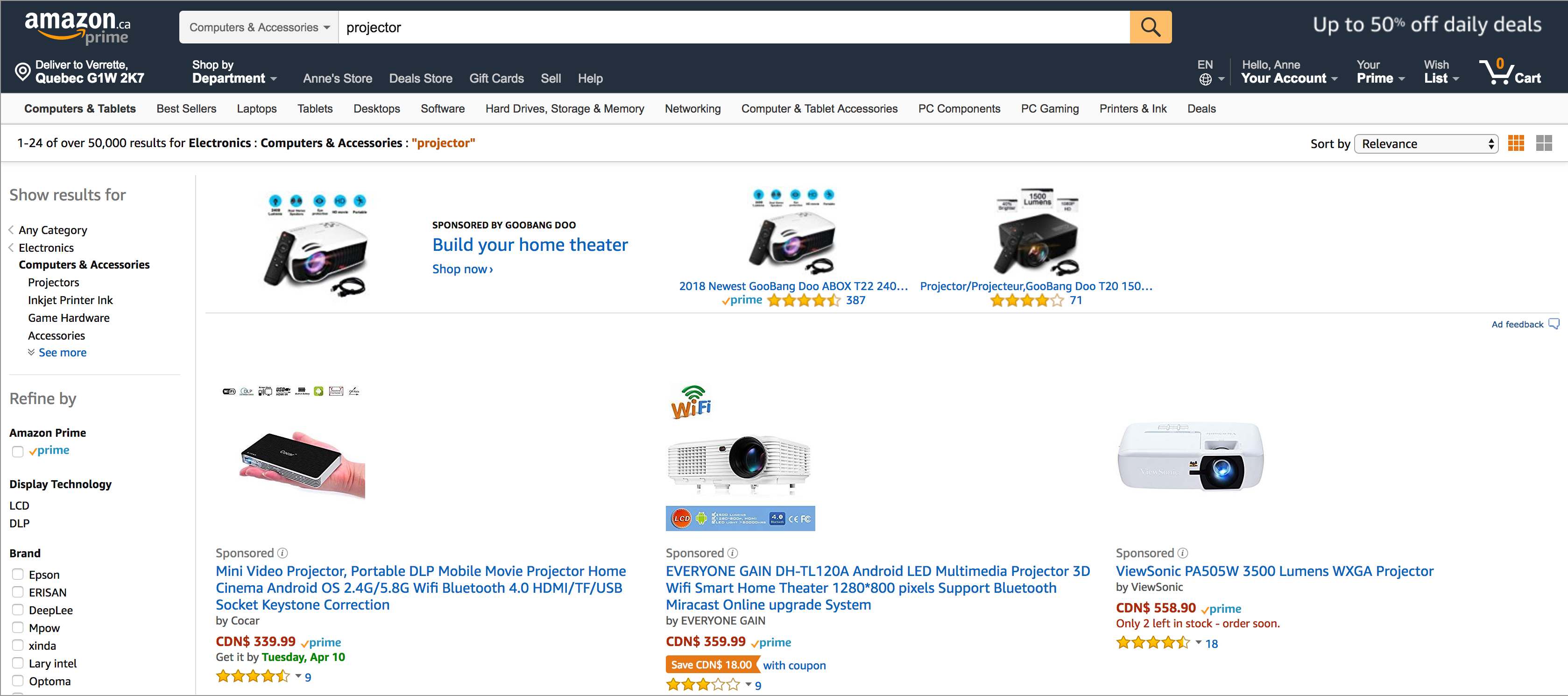
Because there are multiple levels in a hierarchy to show, Amazon.ca uses links in a facet to narrow search results one step at the time. The facets below it will adapt depending on the category selected.
For parallel selection or batch filtering, check boxes are better because they enable users to limit the scope of search results to those matching the criteria selected. Check boxes indicate an additive “or” condition, for example: “I want to narrow my search result to: Brand equals Philips, LG, or Sony”.
The two paradigms complement each other very well. However, mixing them can result in a confusing search user interface. Mixing them means a user could select criteria in multi-level categories, for example: “I want to narrow my search result to: Department equals Projectors where Brand equals LG, Sony, and Philips, AND Department equals Game Hardware where Memory capacity equal 8GB or 4GB”.
You can already see that this can be confusing and there is a high chance that no result will be found because there are too many criteria to match. Also, always remember that people have poor research skills in general, as pointed out in 2011 by Jakob Nielsen. It’s always a good idea to stick to what people know and use standard facets that only depict one of the two paradigm at the time.
Are there Downsides to Facets?
Not many, but yes, there are some, and it is important you consider them before adding 15 facets to your search page!
First, to have great facets that are relevant to the search experience, you need to have a good content structure behind it. The content (existing and future) must have applied metadata for each facet. It’s also important to note that the way you classify your products internally in your index will end up on a facet as criteria. So if you use business jargon or industry-specific terms, it is likely people won’t be able to relate to it.
Secondly, faceted navigation presents more options to the user, increasing the efforts that the user must deploy to interact with the component to reach their goal. Because the interaction cost is higher with facets, we need to be sure that they add value to the search experience. On some search pages with less content, facets are not necessary and other filters like product category tabs or sections can better fulfill the filtering requirement.
Overall, when presented correctly, facets are a fantastic and powerful component that can save users a lot of time and make their quest for results way easier.
1 Whitenton, K. (2014). Filters vs. Facets: Definitions. NNGroup. Retrieved from https://www.nngroup.com/articles/filters-vs-facets/
2 Nudelman, G. (2011). Designing Search: UX Strategies for eCommerce Success. 368 p.
