Companies are becoming more and more aware of the importance of offering a good search experience on their website. From increases in purchases on ecommerce websites to getting fewer cases on their support and community websites, companies are realizing that helping users find what they are looking for faster and more easily results in a great overall experience.
In the previous blog post, I explained why having a prominent search box is essential. In the second part of this series, I will talk about the key elements to have in your search result page.
When we imagine a search results page, we generally think about what Google (maybe Yahoo!?) have taught us: a linear and prioritized list of results that appears on a new page. As a company doing search for a living, we can’t count the times a client asked for a search results page that looked like Google or Amazon, and we cannot blame them. People like websites that work like the ones they know, and deviating from this expected design almost always causes usability problems.
Here are some guidelines to follow to ensure your search page results meet user expectations.
Was it Black Shoes or Blue Shoes?
Someone looking for a specific product might perform many searches on the same website. If the user doesn’t know what they just searched for, there is good chances they will get confused. A lot of users enter another query to refine the results instead of using sorting and filtering options.
Everytime we ask of our users to remember the query they entered, we are adding cognitive load to the task. It is therefore essential that you repeat the user’s query at the top of the results page. Also, leave the query in the search box until the user enters another query or clears it.

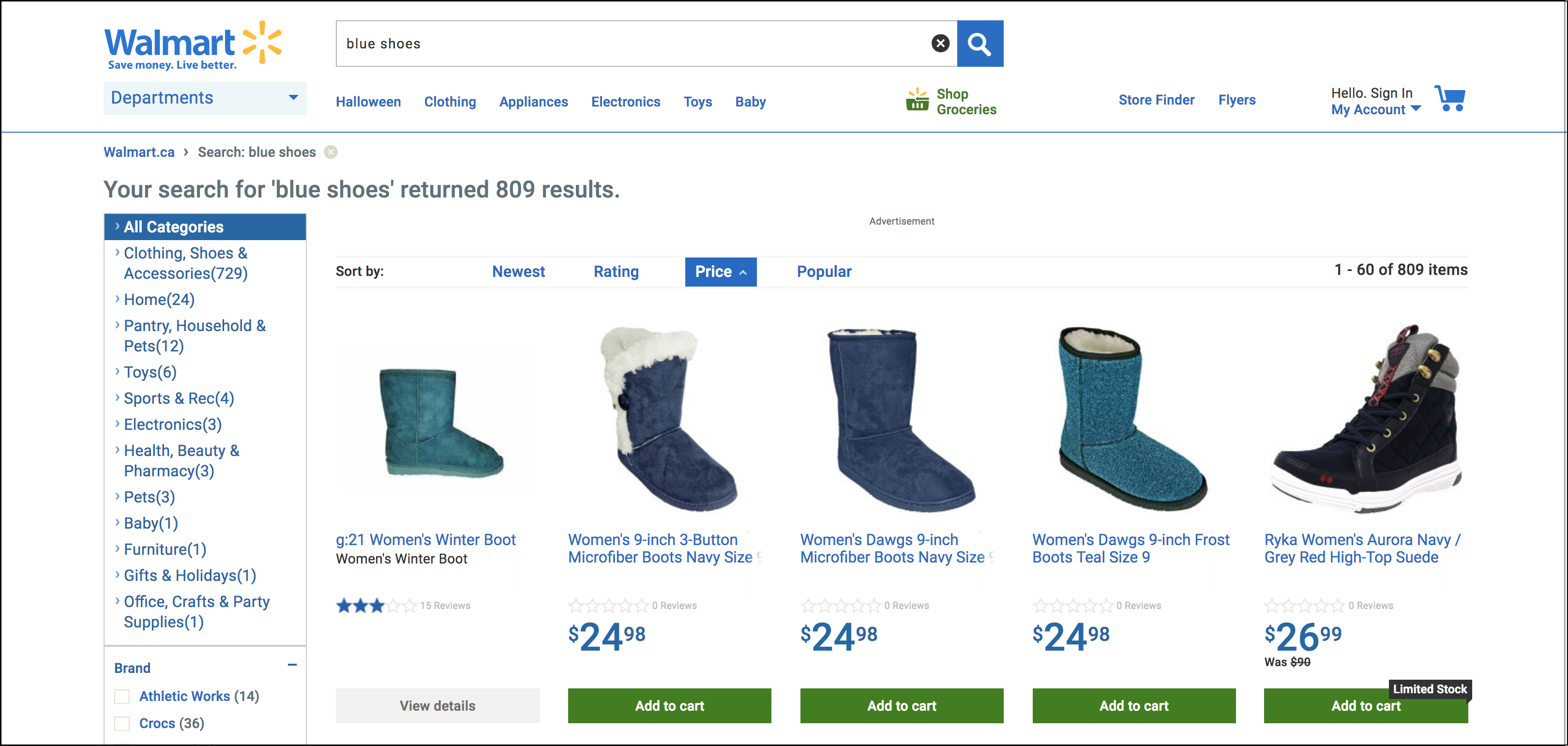
On Walmart’s search page, the query is repeated at the top of the page and is still visible in the search box. They also indicate the number of results matching the query, which is good.
Don’t Be Shy If You Come Back Empty Handed
Some websites seem to be shy to show that no results were found. You don’t have to be. When that happens, clearly state that the search was run and that there were no matches. A page without results is also a good opportunity to offer recommendations based on the query without results, but be sure the user doesn’t confuse the recommended product as the real results. To avoid that, it can be a good idea to name the recommended results section with a title like : “you might be interested in…” etc.

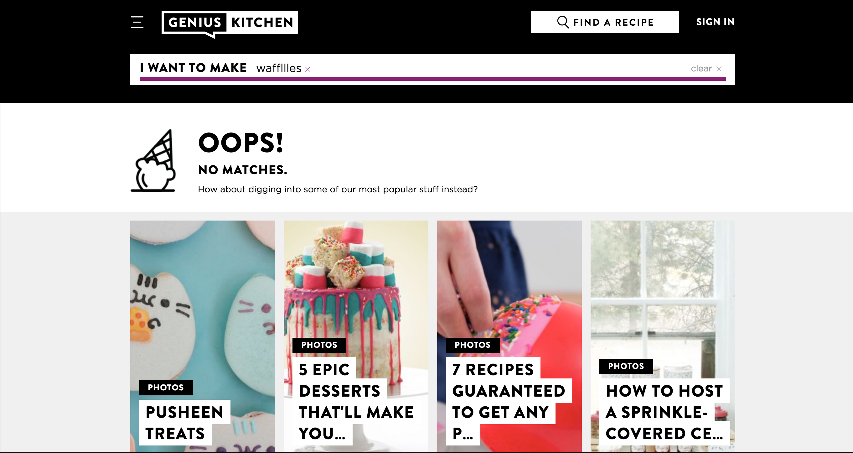
Geniuskitchen.com offer a good example of a no result page. A message clearly indicates that there were no matches and invites the user to look through recommended content.
When there are results (there is a problem if this is not the norm), you want to clearly indicate the number of results at the top of the page. This helps users decide if they need to use facets to further narrow their search or not.
If only one result is found, DO NOT take users directly to the product page, as it can be confusing. Users expect to see a search result page, not a product page. Instead, indicate that there was only one result, and invite users to adjust their search.
Allow Users to View More
A lot of websites have nice headers or banners on their homepage. However, the search results page is not a good place for that. You need to design that page to maximize the number of results users can see, without cluttering the interface.
Depending on the style you choose for the results (for instance, as cards or as a list), there will be a different number of search results on your page. There is no magic number of results to show on a screen. You need to allow users to view more or View All results when they want to.
If View All is not a option because it would cause too much performance issues, offer an opportunity to select the number of results viewed per page.
Sometimes, websites choose to display 10 results per page by default because they don’t want users to scroll. Research shows people actually have no problem scrolling. However, people will only scroll if they feel there’s a hope of finding something relevant to them lower on the page. 1
Knowing that, you might want to use infinite scrolling instead of pagination. We won’t enter in the debate of Infinite scrolling VS pagination, but I can tell you that infinite scroll is usually good for discovery interfaces like Pinterest, and pagination is usually better when the user is looking for something particular in the result list, such as on an ecommerce website. 2
Keep Relevancy Scores to Yourself
Finally, for a good search experience, relevance is key. Users are often confused when the results at the top of the list are not their desired products or documents. Even if it’s cool to know why a result appears at the top of the result list, users don’t need to know their relevance scores. For them, it’s mostly noise, as they are not interested or aware of the factors that influence ranking.
Relevance is your secret magic to offer relevant results to users. Keep it that way!
Conclusion
Overall, the search page is a place where it’s alright to stick to basics and the well worn paths. You can of course still be creative, but try to not deviate too much from what users expect, as it can often lead to confusion and frustration. In the next post, I will talk about another important thing in the result page: sorting and faceting.
1 NUDELMAN, G. (2011). Designing Search: UX Strategies for eCommerce Success. 368 p.
2 BABICH, N. (2016). UX : Infinite Scrolling vs. Pagination. UX Planet. Retrieved from https://uxplanet.org/ux-infinite-scrolling-vs-pagination-1030d29376f1
