As some of you guys may know, Dreamforce is one of the biggest event in the enterprise software industry. For the #DF15 edition, we wanted to do a little something different than what we had done previously.
We wanted to create something by combining marketing and R&D efforts. There were a few simple rules to follow:
- Be able to create something in about 1.5 months or less.
- Do not replicate/copy Salesforce’s Dreamforce app - complement it
- Try some new technology or frameworks
- Showcase Coveo’s capabilities but be distant enough of Coveo for Salesforce
- Be awesome
- Have fun
The project was also intended to be a huge hackathon on evenings and weekends… it ended up being a lot more.
The Design
Our timeframe was really restricted! We had to think of how to build something awesome really quickly. Numerous ideas were thrown on the table of what the app could be : should we leverage the Dreamforce agenda? Be more social-oriented? Make a party app? At some point, we even thought about creating a real-time social media aggregator on top of Dreamforce… Let’s say the discussions were flowing!
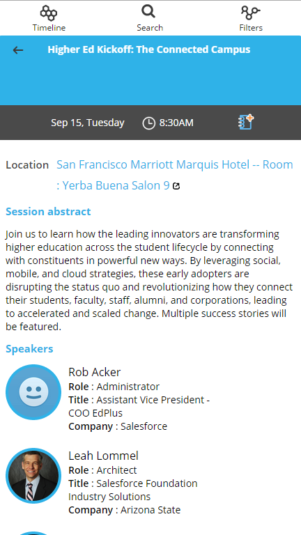
Leveraging attendees’ own custom agenda (through their Salesforce credentials) would have been really cool, but it would have implied authentication to Salesforce which we just didn’t have time to build. We also explored the Dreamforce website to see what was available at that point. We then decided to do what Coveo has the capability to do: create relationships between data you wouldn’t even think exist. By leveraging Dreamforce’s sessions, themes and speakers, we could associate them with external related content such as Twitter, LinkedIn, SlideShare etc. The idea was born!
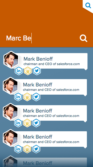
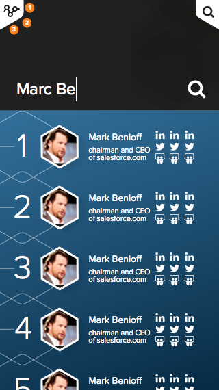
Quickly, our power UX team came with an original idea : everything would be hexagonal-oriented. (Nothing to make a developer’s life easy…) We had to make a lot of iterations on mockups to have something that would satisfy everyone. You can see that from the first iteration from the actual result… it changed a bit.


Techno techno techno
Lots of questions to ask here : Is it client-side only or do we want a back-end as well? Which language? Should it be a native app for mobiles? Which framework?
At Coveo, we have our own Javascript UI Framework (JS UI to make it short) that enables people to easily create custom search pages. Problem is, it comes with a whole lot of functionalities that we did not need in our app, the app concept is really different from what we usually do. Quickly enough, we stripped out what we call the Search Endpoint (module who’s responsibility is to build and execute queries on the Coveo Cloud platform) from the JS UI to make our app as light as possible. Obviously, we were not going to write everything in pure JavaScript without any external help… so came the important time to choose a JS framework to build on top of it. We explored a few things here and there (and also invoked the possibility to do it in TypeScript just like our actual Coveo frameworks)… and decided to use the most trending, buzzwordy, “à la mode” javascript framework of the week… React.
React comes with a really different architecture traditional developers are not used to. We also added the classic tools to make the development easier such as gulp and webpack… and quickly added react-router in the project to manage our URLs. Some parts of the app were well suited for React, such as session details (including related/external content)… but others such as the complete honeycomb view were more… let’s say tricky.
We tried to respect the React architecture and split into as many components as possible, respecting the fact that we did this as a hackathon. For instance, in the Hexagon Details page, you can find components for :
- The application container
- Hexagonal header
- Session/Keynote excerpts
- Result list and result list items
- A variety of templates for each different kind of content
It would have been really fun to do it in TypeScript instead of JavaScript, but with our early experiences, it felt like the React/Typescript integration was not mature enough to build something without doing some hacks on Typescript itself (this github issue covers most of it).
Connectors!
When you need search, you obviously need one/some/a thousand connectors behind to feed the index some data. When we started, we had a plan for the following sources :
- Dreamforce website
- Chatter
- SlideShare
- YouTube
The Dreamforce website was entirely crawled using web scraping. We are simply getting the pages and extracting the information we want from the HTML. We were lucky enough that the Dreamforce website was available early (and that the html structure did not change). We’ve been able to quickly adjust to the data, then enrich it with location and dates of the sessions when they were published at the beginning of August.
For the remaining sources… it was like tossing a coin and hoping it to fall on the good side. YouTube was essentially a freebie since we have a productized connector for it. The same thing applies for the Twitter crawling. For SlideShare, we had to develop a new connector, which is quite simple but powerful. We simply have to specify which accounts we want to crawl. Then… LinkedIn and Salesforce Chatter gave us some problems. The API restrictions on LinkedIn did not allow us to store data… while Chatter did not give interesting results. Sooo, as every software project, we had to adjust and then decided to drop LinkedIn and add Facebook groups in the loop (which is a custom connector, again). We then, finally, added Instagram since everybody enjoys seeing pictures of food and beaches while being at Dreamforce. The Instagram crawling is kinda unique since it uses the location of Dreamforce to crawl every post that is made from a nearby location.
Hexagons
Thankfully, building an infinite horizontal scrolling view made only of hexagons was a piece of cake… NOT. Ohh, and that infinite horizontal view needs to be awesomely fast on mobile. There were a few challenges and a few iterations were needed before we got to something smooth enough and acceptable.
The biggest challenge with the scrolling timeline was that we couldn’t preload all the hexagons because it would have generated too much DOM and would have been as responsive as an airplane multimedia system. To overcome that, we had to dynamically inject and remove the hexagon as the user scrolls to keep the DOM as small as possible while keeping a virtual space representing the hexagon to-be-injected space.
This led to some magnificent pieces of code like this:
var smallWindow = 630;
var so******SmallWindow = 550;
var hexagonSize = [Math.ceil(120 * 1.08), Math.ceil(140 * 1.16), Math.ceil(170 * 1.08)];

var nbEvents = this.props.events.length + (this.props.first ? 1 : 0) + (this.props.events.length > 10 ? (Math.ceil(this.props.events.length / 10) - 1 ) : 0);
var width = hexagonSize[this.props.hexaSize] * (Math.ceil(nbEvents / 3) + (nbEvents % 3 != 1 ? 0.5 : 0));
Basically, this code is responsible for measuring the size of the hexagons. We needed to round the number up since we haven’t mastered the pixel split yet.
Everything is mobile-friendly
At some point, we decided that it would be cool to have something on the App/Play Stores. Reproducing the app for iOS and Android was just unrealistic, so we decided to go with a Webview approach. We had some experience with Phonegap but we weren’t convinced that it was the way to go since it comes with a lot of feature that we didn’t need in the end. We decided to create our own simple webview apps instead.
iOS
Dreamforce was all about trying new technologies so we decided to implement the iOS app in swift. We implemented a UIWebView and added some logic to open external links outside the app. The code is pretty simple and is available here.
Android
Android app has a little more code because we wanted to support the integrated back button of Android devices. It means that some WebView options need to be enabled like JavaScript and LocalStorage. The code is also available here.
As you can see, the iOS and Android specific code is really small and this technique allowed us to have a single codebase apart of these two snippets. It also enables us to update the app easily without having to submit the app through the App Store review process that can take a couple of days.
What we learned/What can be reusable
Overall, we really enjoyed our experience. We developed an expertise in React and really liked it, and would probably like to reuse it on a new project or even maybe in the next generation of our JS UI framework or our cloud administration interface, who knows? We also developed a bunch of new connectors that, with a bit more work and features, could be integrated into the Coveo offering.
It was a really intense project, which ended in a really nice app we’re proud of. It’s obviously not perfect and we dropped some features along the way (such as implementing the desktop mockups, adding some facets etc.), but we’re proud of the result and really hope the Dreamforce crowd will enjoy it. It also offers us an app template that we could maybe reuse for some other events!
Don’t forget to go download the app, and huge thanks for everyone that contributed in the app!
