Behind the scenes, the Coveo JS UI framework is built entirely in TypeScript. Obviously, it’s intended to be customized in JavaScript, but you may want to go further and create your own component in TypeScript. Be aware that this uses the internal JS UI APIs, so it can eventually break when updating. Purpose of the post is to give a glimpse of how the components are built internally.
Huge disclaimer : I am definitely not a TypeScript expert, and I am not working in the JS UI team. It is possible that my code is not optimized. This is more to give a basic guideline :D
Huge disclaimer #2 : This article also implies that the reader has basic notions of TypeScript and the Coveo JS UI.
If you have ever downloaded the Coveo JS UI framework, you may have noticed that there’s a folder named lib in there. This folder contains the TypeScript definitions files we will need.
A component? What are we even talking about?
The JS UI is basically made of components, which are the different parts you can simply drop in your page. It goes from the facets, sorts, result lists to more advanced stuff such as the folding or analytics. On an architectural point of view, it is important to understand that a component should have a single responsability and should (at least try to) not impact others.
So, what do we want to build?
My use case was fairly simple : I wanted to create a component I called the ToggleResultList. This component would be a simple button allowing you to have different result lists in the same page (probably with a different style) and toggle between them. The main goal is to have something I can drop in my markup like this :
<span class="CoveoToggleResultList" data-result-list="#MainResultList"data-icon="default-result-list"></span>Where the MainResultList is the ID of the HTML element containing the result list. Something like :
 <div class="CoveoResultList" data-wait-animation="fade" id="MainResultList" data-result-container-selector="#ResultsContainer">
  ...
</div>
For details on the options on the Result List, you can refer to the Developers documentation on the component.
The TypeScript frame
So, let’s start by building the most basic component we can.
/// <reference path="../lib/CoveoJsSearch.d.ts" />

module Coveo.Test {
    export class ToggleResultList extends Coveo.Ui.Component {
        static ID = 'ToggleResultList';

        constructor(public element: HTMLElement,
                    public options?: any,
                    bindings? : Coveo.Ui.ComponentBindings) {
            super(element, ToggleResultList.ID, bindings);

        }
    }
}

Coveo.Ui.CoveoJQuery.registerAutoCreateComponent(Coveo.Test.ToggleResultList);
Let’s take a small breath, look out the window, and then focus on what we just wrote. For now, it doesn’t do a single thing, but the frame is there. We start by referencing the Coveo Js Search definition file, which will allow us to compile the whole thing. Then, we create our own class that extends Coveo.Ui.Component, which is the base class for any JS UI component. We then need an ID. This will get interpreted as CoveoToggleResultList in the markup, allowing anyone to drop this element in their page.
The constructor takes 3 parameters : the actual HTML element, any options that could be set on the component (we will come back to this further) and the current bindings (such as which search interface we are in). Don’t forget to call the basic constructor!
Finally, we use the framework to register the component. This line is really important, as it will indicate the JSUI to consider your block of code as an authentic component. From now on, you could compile your TypeScript code and integrate it in your page, right after CoveoJsSearch.min.js.
Be sure to check out Will’s excellent blog post on how to create a successful build process.
Adding some functionality
We have a component, it’s kinda cool! But it would been even cooler if it actually did something… Let’s add some stuff.
/// <reference path="../lib/CoveoJsSearch.d.ts" />

module Coveo.Test {
    export interface ToggleR1esultListOptions {
        resultList: HTMLElement;
    }

    export class ToggleResultList extends Coveo.Ui.Component {
        private static coveoResultListClass = '.CoveoResultList';
        private static disabledClass = 'coveo-disabled';

        static ID = 'ToggleResultList';
        static options: ToggleResultListOptions = {
            resultList: Coveo.Ui.ComponentOptions.buildSelectorOption({ defaultFunction: () => $(ToggleResultList.coveoResultListClass).get(0) })
        };

        constructor(public element: HTMLElement,
                    public options?: any,
                    bindings? : Coveo.Ui.ComponentBindings) {
            super(element, ToggleResultList.ID, bindings);

            this.options = Coveo.Ui.ComponentOptions.initComponentOptions(element, ToggleResultList, options);

            Assert.exists(this.options.resultList);

            this.bind.onRoot(Coveo.Events.QueryEvents.querySuccess, (e: JQueryEventObject, args: Coveo.Events.QuerySuccessEventArgs) => this.handleQuerySuccess(e, args));
            $(this.element).click(() => this.handleClick());
        }

        private getClassName(): string {
            return '.' + Coveo.Ui.Component.computeCssClassNameForType(ToggleResultList.ID);
        }

        private handleQuerySuccess(e: JQueryEventObject, data: Coveo.Events.QuerySuccessEventArgs) {
            if (!$(this.options.resultList).coveo().disabled &&
                !$(this.options.resultList).is(':visible')) {
                $(this.options.resultList).show();
            }
        }

        private handleClick() {
            $(this.getClassName()).addClass(ToggleResultList.disabledClass);
            $(this.element).removeClass(ToggleResultList.disabledClass);
            $(ToggleResultList.coveoResultListClass).coveo('disable');
            $(ToggleResultList.coveoResultListClass).hide();
            $(this.options.resultList).coveo('enable');
            $(this.getBindings().root).coveo('executeQuery');
        }
    }
}

Coveo.Ui.CoveoJQuery.registerAutoCreateComponent(Coveo.Test.ToggleResultList);
As you can see, we added some options in there. Those options are interpreted as data attributes in the markup. We will then be able to associate the component to a specific result list. You may wonder why we created a static options class…
- It’s how the JS UI components are built.
- It makes them compatible with the interface editor, which would allow anyone to simply drag and drop your component in a new or existing search page. (that’s for the interface part)
In our options for now, we simply added a ResultList, which is a selector option (meaning it points to another HTML element). There’s a huge variety of options you can have, simply use the autocomplete feature in your favorite IDE to see them :D What is really important is in the constructor, we need to initialize the options, this will make the link with the component.
We then bound our component to two events : the regular jQuery click event and the JS UI’s query success event. You can refer again to the Developers documentation to learn more about these events. The click event is responsible to disabling the other result lists and then to trigger a query on the one that should be shown. ==> It is important to actually disable and not just hide other result lists, since in the case the events would stay bound on them, so it would mess with your search page state.
You may also wonder why we show the result list in the querySuccess event instead of the click one… simple : we need to make sure the query has enough time to be executed. If we were to show it right away, it would “flick” a few milli-seconds and not be enjoyable for the user.
Adding mooaaaarrrr options
So, we have a component working, isn’t this nice? If you’re really building something that other developers might use, you may want to add even more options to your component to make it really awesome.
/// <reference path="../lib/CoveoJsSearch.d.ts" />

module Coveo.Test {
    export interface ToggleResultListOptions {
        defaultResultList?: boolean;
        icon?: string;
        numberOfResults?: number;
        resultList: HTMLElement;
    }

    export class ToggleResultList extends Coveo.Ui.Component {
        private static coveoResultListClass = '.CoveoResultList';
        private static disabledClass = 'coveo-disabled';

        static ID = 'ToggleResultList';
        static options: ToggleResultListOptions = {
            defaultResultList: Coveo.Ui.ComponentOptions.buildBooleanOption({ defaultValue: false }),
            icon: Coveo.Ui.ComponentOptions.buildIconOption(),
            numberOfResults: Coveo.Ui.ComponentOptions.buildNumberOption({ defaultValue: 10 }),
            resultList: Coveo.Ui.ComponentOptions.buildSelectorOption({ defaultFunction: () => $(ToggleResultList.coveoResultListClass).get(0) })
        };

        private iconTemplate = \_.template("<span class='coveo-icon <%=icon%>'></span>");

        constructor(public element: HTMLElement,
                    public options?: any,
                    bindings? : Coveo.Ui.ComponentBindings) {
            super(element, ToggleResultList.ID, bindings);

            this.options = Coveo.Ui.ComponentOptions.initComponentOptions(element, ToggleResultList, options);

            Assert.exists(this.options.resultList);

            if (!this.options.defaultResultList) {
                $(this.options.resultList).coveo('disable');
                $(this.options.resultList).hide();
                $(this.element).addClass(ToggleResultList.disabledClass);
            }

            this.bind.onRoot(Coveo.Events.QueryEvents.buildingQuery, (e: JQueryEventObject, args: Coveo.Events.BuildingQueryEventArgs) => this.handleBuildingQuery(e, args));
            this.bind.onRoot(Coveo.Events.QueryEvents.querySuccess, (e: JQueryEventObject, args: Coveo.Events.QuerySuccessEventArgs) => this.handleQuerySuccess(e, args));
            $(this.element).click(() => this.handleClick());

            this.render();
        }

        private getClassName(): string {
            return '.' + Coveo.Ui.Component.computeCssClassNameForType(ToggleResultList.ID);
        }

        private handleBuildingQuery(e: JQueryEventObject, data: Coveo.Events.BuildingQueryEventArgs) {
            if (!$(this.options.resultList).coveo().disabled) {
                data.queryBuilder.numberOfResults = this.options.numberOfResults;
            }
        }

        private handleQuerySuccess(e: JQueryEventObject, data: Coveo.Events.QuerySuccessEventArgs) {
            if (!$(this.options.resultList).coveo().disabled &&
                !$(this.options.resultList).is(':visible')) {
                $(this.options.resultList).show();
            }
        }

        private handleClick() {
            $(this.getClassName()).addClass(ToggleResultList.disabledClass);
            $(this.element).removeClass(ToggleResultList.disabledClass);
            $(ToggleResultList.coveoResultListClass).coveo('disable');
            $(ToggleResultList.coveoResultListClass).hide();
            $(this.options.resultList).coveo('enable');
            $(this.getBindings().root).coveo('executeQuery');
        }

        private render() {
            var icon = this.options.icon;
            if (icon != "") {
                $(this.element).prepend(this.iconTemplate({icon: icon}));
            }
        }
    }
}

Coveo.Ui.CoveoJQuery.registerAutoCreateComponent(Coveo.Test.ToggleResultList);
You may notice there’s now 3 more options of different types.
- You can specify if the component is targetting the “default” result list. This means this will be the one shown by default, and the other will be hidden at the beginning (in the previous example, you would have to do it manually).
- You can specify the number of results of the result list. Normally, you would specify it on the whole Search Interface, but you may want to display a different number according to which result list is shown. We’re hooking on the buildingQuery event to change the number of results according to the options.
- You can specify an icon! Using an UnderscoreJS template, this is a simple commodity to render nicely an icon for your component.
Wrap it up!
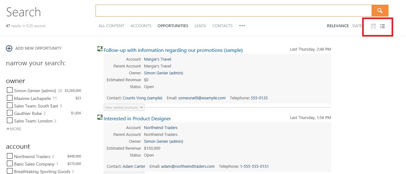
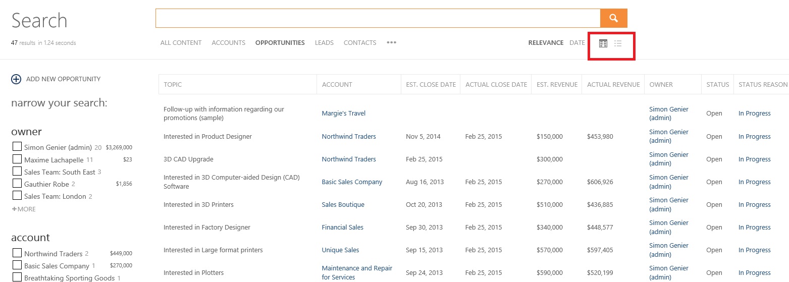
Now, my real use case was to give the user the possibility to toggle between a “regular” view and a “tabular” view. My markup looks like this, where the TableResultList and MainResultList are two different elements containing the two different result lists templates :
<div class="coveo-toggle-result-list-section">
    <span class="CoveoToggleResultList" data-result-list="#TableResultList" data-number-of-results="50" data-icon="table-result-list"></span>
    <span class="CoveoToggleResultList" data-result-list="#MainResultList" data-default-result-list="true" data-icon="default-result-list"></span>
</div>
If you wonder, it is located just under the search box in a typical JS UI search page.
And the visual result looks just like this:


Thanks a lot for reading! :D
