Organizations are becoming more and more aware of the importance of offering a good search experience on their website. From an increase in purchases on ecommerce websites to getting fewer cases on their support and community websites, companies are realizing that helping users find what they want faster and more easily results in a greater overall user experience.
In this series of blog posts, I will explain why having a good search experience is vital for any website. This blog post will tell you about the importance of the search box.
In order to deliver a good search experience, users have to be able to find the search box. It may seem obvious, but too many websites fail to make their search box prominent and easy to find. There are many reasons that can explain that. One of them is that, in the past years, there has been a design trend to hide the search box behind a link or a nice magnifying glass icon.
However, while they please the eye and match the look and feel of the website, those design patterns can do more harm than you might think. For example, did you know that if your search box is hidden behind a link, users will assume that you are trying to hide your search because it is poor?1 To prevent that, always make sure that your search box is visible and prominent by following these tips.
First rule of good search: finding the search box
The good old open field is good for a reason
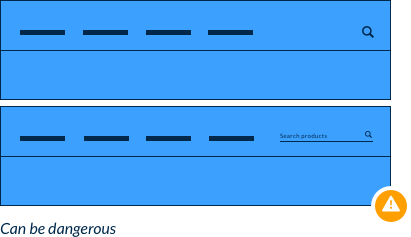
When users want to perform a search, they are used to scanning the page for an open search field, not a link or an icon. Even if it might seem obvious for us, a lot of users don’t recognize the magnifying glass icon as the search tool.
You might also be tempted to add placeholder text in the input to help the user know what they can search for. Studies have shown that this is not a good practice because users do not see it as an open field.2 Once the user clicks on the field, the placeholder text disappears, so that text won’t be useful for the user anymore. If you really need to add information, place it below the field rather than in the field.

Make it pop. At least a little.
Even if it looks pretty and sophisticated, try to avoid dark on dark and light on light search boxes. We talked about the importance of having an open search field for search tool, but if that field is the same color as the background, there is a high chance users will miss it. Contrast is essential to make the search box noticeable. That’s why you want to choose a background color or picture that will make the search box stand out.


Middle or right, it’s up to you !
We’re not talking about politics here, but about the position of the search box. If you followed the previous recommendations, your search tool is a clean, empty search box that stands out from the background. You’re halfway there!
The convention of the past 20 years has been to have the search box in the upper right corner of the page. Users are accustomed to find the search box there, and so you are encouraged to also put it there for easier findability.
However, you can also decide to put it in the middle of your header, as long as you make sure that the search box is big enough and eye-catching.
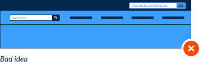
Putting the search box in the upper left corner is usually considered a bad idea. If you think you can pull it off with a big enough, particularly noticeable search box, you may want to try it out through A/B testing and see how it goes.
Be careful not to put something that looks like a search box in the right corner. Some websites put the mailing list subscription field in the right corner and users often confuse it with the search box.

Conclusion
Overall you need to remember that your search box has to be prominent and easy to locate. In some use cases, minimalist search boxes might work fine, but before you choose this design, try to test it with real users to see if they really can find the search box easily. There is no perfect recipe that will work with every website, but if you follow those best practices, it will surely increase the search engagement on your website and will certainly result in a higher conversion rate.
1 NIELSEN, J., SHADE, A. E-Commerce User Experience. Nielsen Norman Group. 5(3),148p.
2 SHERWIN, K. (2014). Placeholders in Form Fields Are Harmful. Nielsen Norman Group. Retrieved from https://www.nngroup.com/articles/form-design-placeholders/